In research, effectively transforming complex datasets into clear and engaging visuals can significantly amplify the impact of findings for public health and medical researchers. At Decilion, we utilize data visualization tools to communicate these findings effectively. By harnessing the power of data visualization, we support scholars to make their studies more accessible, understandable, and impactful. We collaborate with researchers dedicated to public and global health, ensuring their findings can reach broader audiences worldwide.
Why should researchers visualize their work?
Data visualization is crucial because it is an indispensable aspect of modern research. It transforms raw data into visual contexts, such as graphs, charts, and maps, making identifying patterns, trends, and outliers easier.
Effective visualizations can:
- Simplify complex information: Visual elements allow us to quickly grasp complicated data and trends. When presented visually, it becomes more accessible and less intimidating, enabling us to understand large datasets at a glance.
- Enhance communication: Visuals are generally more effective than text alone, especially for those who may not be experts in the field. A well-crafted infographic or dashboard can convey a message more clearly and effectively than a lengthy written report.
- Facilitate insight: Data visualization aids in discovering insights that might be missed in text-based reports. When data is visualized, patterns and correlations become more apparent, helping researchers to draw meaningful conclusions.
Analysis focus: World Health Statistics 2024
For this blog, we decided to share with you some tools we use in our projects to create interactive and appealing graphics and charts. We will use data from the World Health Statistics 2024 report, which includes health statistics by country and area, WHO region, and globally. The data comprises official WHO statistics, focusing on selected health-related Sustainable Development Goal (SDG) indicators and Thirteenth General Programme of Work (GPW13) indicators based on the latest available data from early 2024.
Advanced tools for data visualization
To effectively interpret and present the World Health Statistics 2024 data, Decilion employs several advanced tools to create sophisticated and interactive visualizations. These tools are essential for health researchers looking to generate high-quality, impactful visuals. Among the top tools we use and recommend are:
Datawrapper
Datawrapper is an intuitive and user-friendly tool perfect for creating quick and straightforward visualizations. It supports a wide variety of chart types, but the best ones are tables and maps.
One of its principal features is the ease of embedding charts into websites, making it ideal for researchers who need to publish data visualizations quickly. While customization options are more limited than other tools, its simplicity and speed make it a favorite for those who need to create clear and professional visuals with minimal effort.
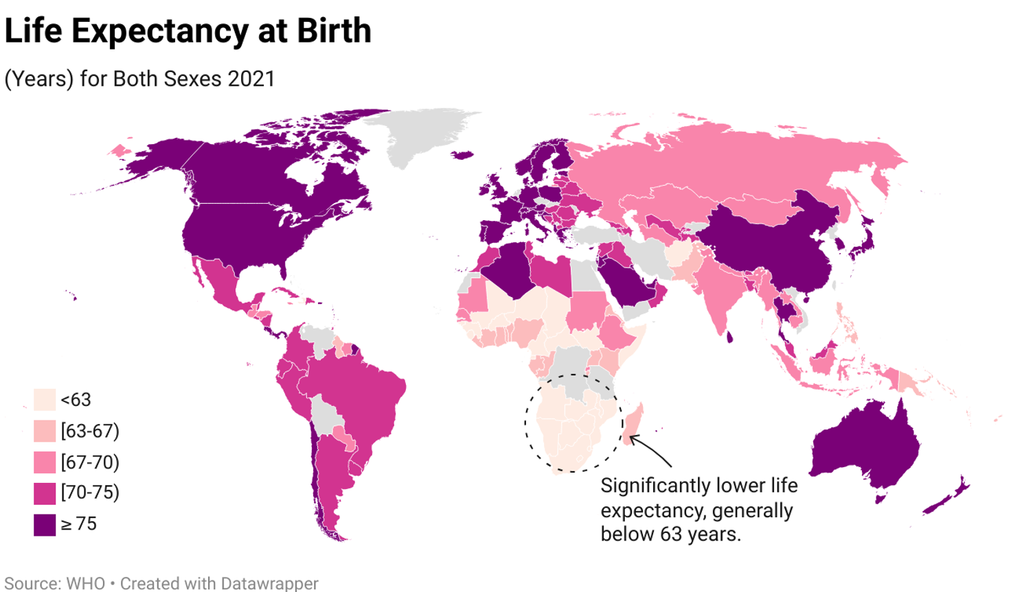
The following map illustrates the global life expectancy at birth for both sexes in 2021, with countries color-coded according to their respective life expectancy ranges. Notably, Africa and a few other regions exhibit significantly lower life expectancies, roughly below 63 years.
Flourish
Flourish is recognized for its intuitive interface and focus on storytelling through data. It offers various pre-made templates for multiple visualizations, making it easy for researchers to create visually appealing and interactive stories.
The best feature of Flourish is its interactive capabilities, which are particularly suited for creating compelling and engaging narratives with data. It is also easy to embed into websites and allows you to upload data via CSV or Google Sheets.
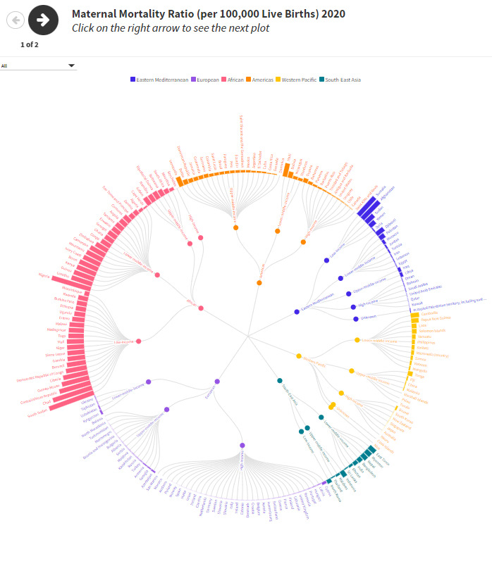
This hierarchy radial plot visualizes the maternal mortality ratio (MMR) per 100,000 live births in 2020 across different countries and regions, classified by income level and WHO regions. Each segment represents a country, colored according to its WHO region and grouped by income classification. The plot highlights disparities in maternal mortality, with low-income countries generally exhibiting higher MMRs compared to high-income countries.
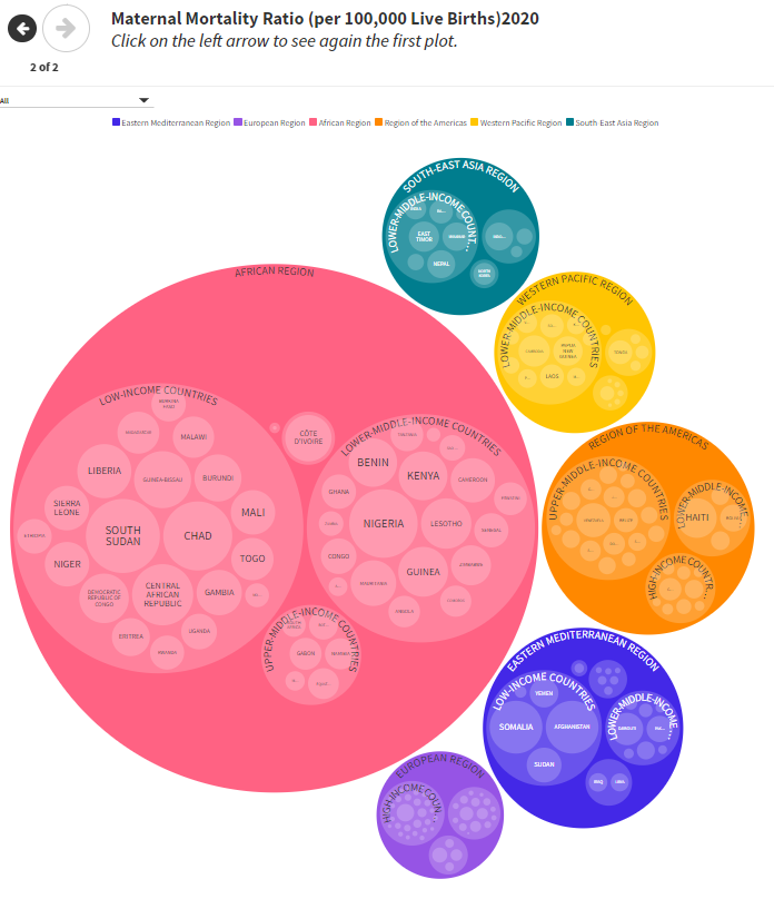
In the second part, the same information is presented using circles. In this representation, larger bubbles signify higher maternal mortality rates, clearly comparing the data.
Tableau
Tableau is a powerful data visualization tool that offers extensive chart types, including advanced visualizations. Its best feature is the highly interactive dashboards and story points, which allow users to explore data in depth and uncover insights dynamically. Though it requires some learning, its robust customization and formatting options make it a top choice for researchers and advanced professionals.
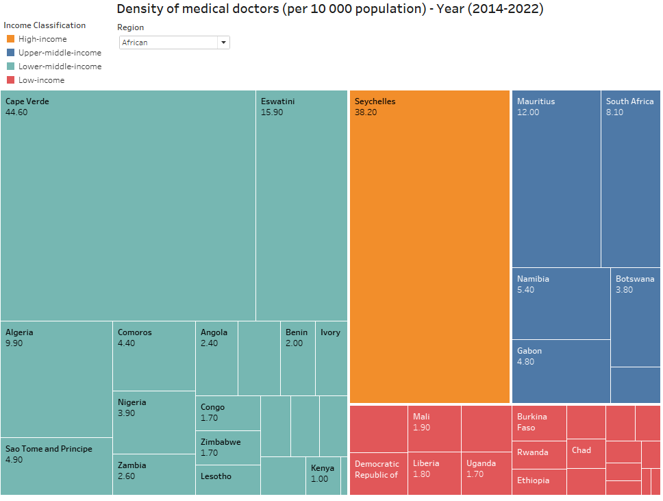
This treemap shows countries color-coded based on their income classification. The region filter dropdown menu also allows us to select and view data from other regions. This visual helps quickly compare the availability of medical doctors relative to the population in these countries and highlights disparities based on income classification.
Highcharts
Highcharts is a versatile JavaScript charting library that requires some coding knowledge but offers extensive customization options. It supports various advanced chart types and has rich interactive features.
The best feature of Highcharts is its high degree of customization and flexibility, allowing developers to tailor visualizations to precise specifications. This makes it an excellent choice for applications that require detailed and interactive data displays, such as real-time data monitoring systems.
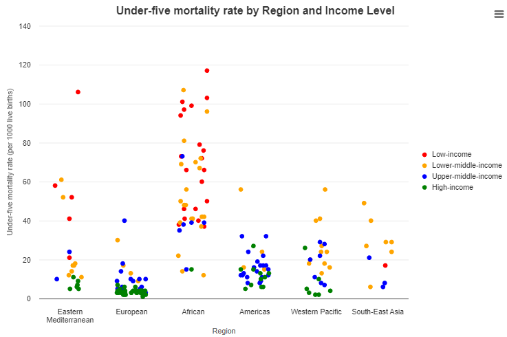
Here, we can see data points color-coded by income level and grouped by region. The African region displays the highest mortality rates, particularly in low-income and lower-middle-income countries. In contrast, regions like Europe and the Americas exhibit lower mortality rates, especially among high-income and upper-middle-income countries. This distribution illustrates significant disparities in child mortality across different regions and income levels.
Loker Studio
Looker Studio is an easy-to-use tool, particularly well-suited for users within the Google ecosystem. It provides standard and advanced charts and allows moderate customization. The best feature of Looker Studio is its seamless integration with Google products and easy sharing options, which facilitate collaborative data analysis and reporting. Its interactive reports and dashboards, equipped with filters and drill-downs, enable researchers to effortlessly create insightful and engaging presentations.
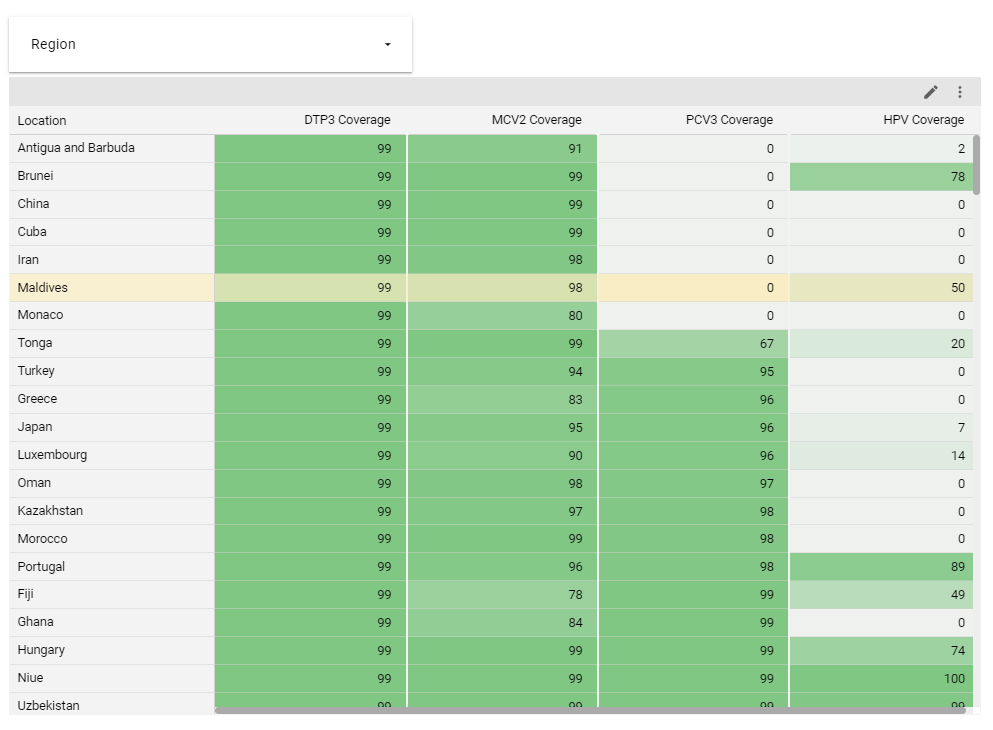
The heatmap visualizes 2022 immunization coverage for DTP3, MCV2, PCV3, and HPV vaccines across various regions, allowing users to filter by region. It shows varying levels of vaccine coverage, with some areas displaying high coverage (darker green) and others with lower coverage (lighter green), particularly for the HPV vaccine. This chart highlights disparities in immunization rates among 1-year-olds and 15-year-old girls across different regions.
Bonus
D3.js is a powerful JavaScript library for creating dynamic, interactive data visualizations in web browsers, offering high flexibility and control over visual output. Similarly, Python and R have extensive libraries like Matplotlib, Seaborn, and ggplot2 for producing various visualizations. Additionally, R’s Shiny package simplifies building interactive web applications and dashboards directly from R.
Conclusion
At Decilion, we believe in the transformative power of data visualization for research. Using advanced tools, researchers can create compelling, interactive visuals that enhance the communication of their findings. These visualizations not only make data more accessible but also more engaging, facilitating better understanding and more informed decision-making.